On the bluest of blue Monday's we have a real treat for you. Baartmans and Siegel's AW11 collection, entitled Deckard, should help transform you from a damp Eeyore to a bouncing Tiger in a matter of stylish moments. Since we showcased the degree collections of the Dutch/English design halves that make up Baartmans & Siegel, the label has become one to watch, recognisable by the pairs use of interactive texture and sharp tailoring. For AW11, they have evolved their offering by developing these signatures even further and have introduced new covetable threads such as the interspersion of draped, soft, rounded tailoring amongst the sharp cuts and have experimented with even more tactile fabrications that provoke endless stroking and much luxurious comfort.

This suit is a new technique of printed velvet, a light base grey allows for a murky cloud print which creates texture and shadow. The pair developed this digital print alongside a velvet specialist to create tailoring of a type, this blogger has not seen before.
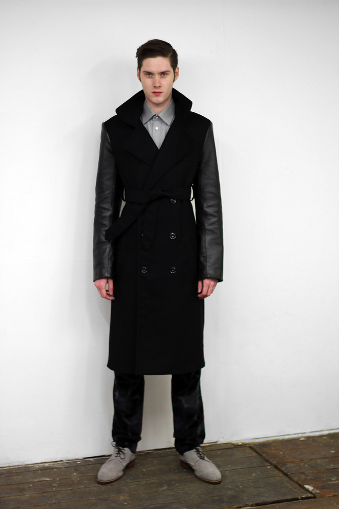
Of course, Deckard takes its inspiration from the 1982 science fiction film Blade Runner. Deckard is the existential detective. The blade runner who tracks down artificial humans in this futuristic noir-scape, ensuring their destruction. However, rather than an obvious homage to the dystopian urban characters and scenes created by Ridley Scott, Baartmans & Siegel looked deeper and picked out key themes to create pieces that are wonderfully subtle yet highly wearable and detail rich. This is performance lux. Functional items that effortlessly combine luxury with a sense of protection throughout.

Texture, texture, texture.
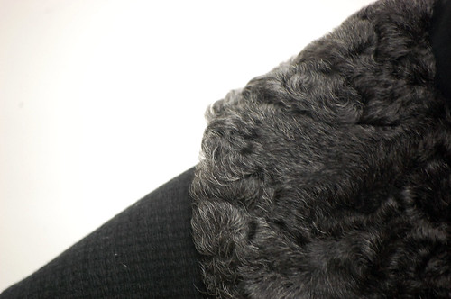
Combinations of texture, always tactcile and ever comforting.
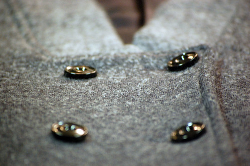
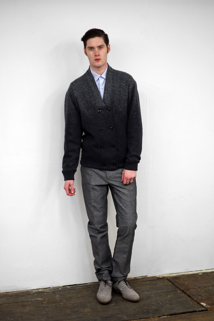
Two pieces which are particularly interesting are constructed by a gradient double knit grey wool which adds a subtle frosting luxe to the casualwear items.
Self described as modern-traditionalists, Wouter Baartmans and Amber Siegel’s work focuses on beautiful fabrics that seduce, and shapes that are accessible yet distinctive. Once again, fabric is key for AW11. Here the collection predominantly uses a variety of silks, wools, linens and mohairs. They have worked with Italian, Japanese and Swiss textile mills to ensure that they have sources the most innovative materials of the highest quality. The collection has been designed so that many of the pieces are interchangeable and to give the wearer more stylistic control. It is important for both Amber and Wouter that each garment is strong individually, while flexible enough to be combined and to interact well with others.
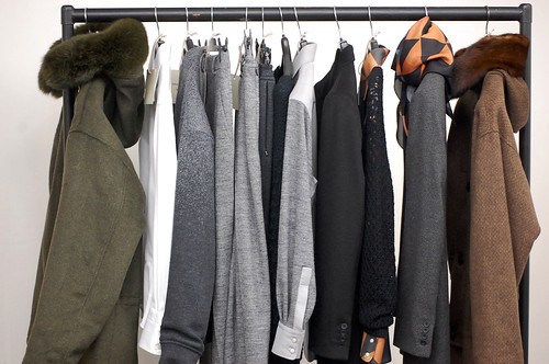
This collection contains many technical fabric elements which relate to their inspiration of futuristic si-fi environments, such as those created int he novel by Phillip. K. Dick- "Do Androids dream of electric sleep? and in Ridley Scott's Blade Runner.
The exciting design duo have always experimented with texture combinations in their collections, at times with spectacular effect, but here the pair have experimented across individual pieces. If the pieces themselves do not demonstrate physical texture, they at the very least demonstrate visual texture. This is a collection that is a celebration of detail and a treat for both the eyes and skin.
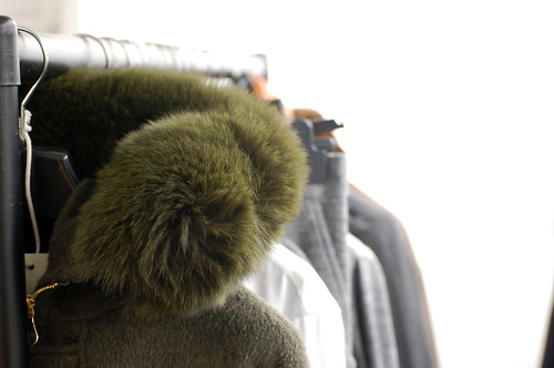
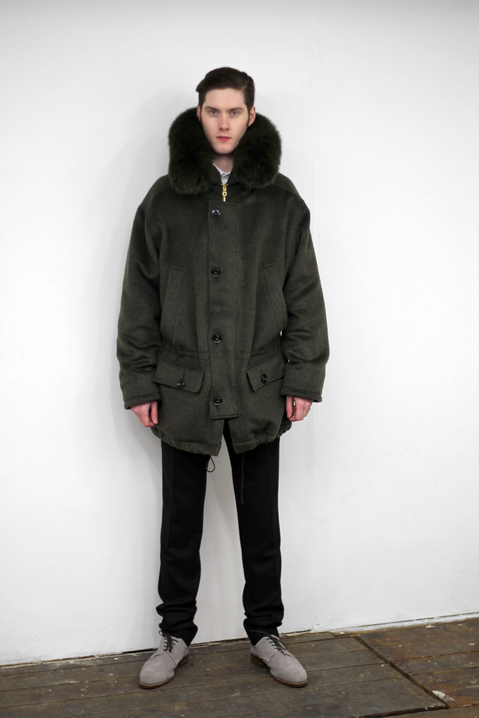
I just love the height of this fur hood. Super luxurious parka.
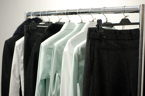
The electric glow of the collection.
Ridley Scott's masterpiece provided a great deal of inspiration for the colour palette. Colour is used with subtle effect, creams, inky cloud prints, greens, burnt oranges echo the protagonist's attire and the dull electric glow that haunts the futuristic urban landscape. The pair replicated some of the technical processes the film producers used to create the logo, they did a lot of a paper placement on their logo development and here, Baartmans & Siegel did the same for their prints.
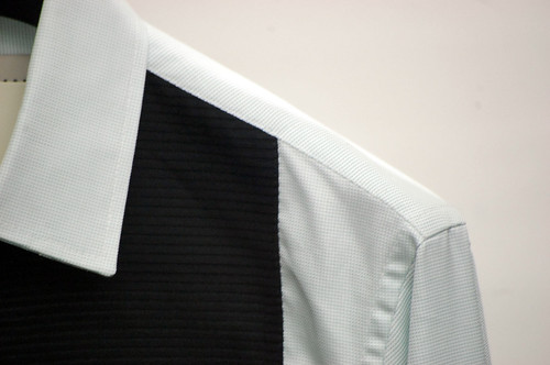
The label's shirts are constructed by a Swiss shirt manufacture which combines two dimensions of woven pin-tuck pleats, highlighting height and depth.
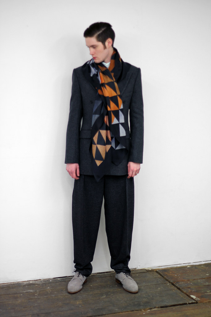
The silk print used on shirts and scarves are hand crafted and created through paper and watercolour placement, which have then been abstracted and distorted through size manipulation and experimentation.


A closer look at the print.
The label's commercial launch by Harrods has been a great chance to gage UK retail, and understand the balance of design and function. For AW11, the Baartmans & Siegel brand ethos continues to focus on Luxury, but due to popular demand, they have also begun to look at incorporating slightly more casual elements. Each season, the design duo have extended the collection, allowing for more versatility and for AW11, they have pushed it even further while still continuing to develop a specifically identifiable handwriting. Each season the pair enjoy building on classic lines and developing more evolved shapes, silhouettes and garments.
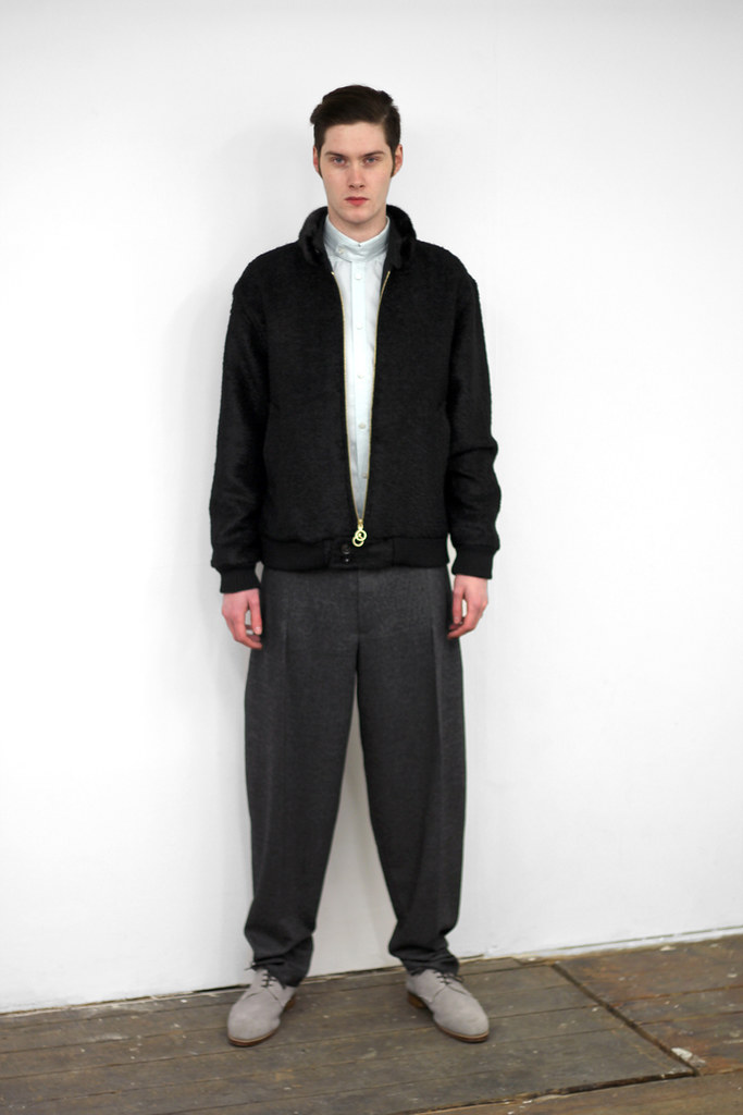
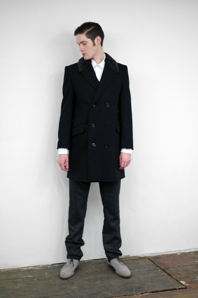
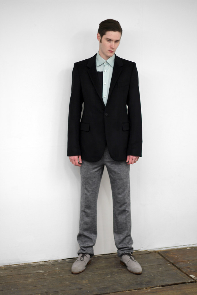
As useful as my detail shots are in highlighting texture play, I'm pleased to be able to share the recently shot collection look book with you...



0 comments:
Post a Comment